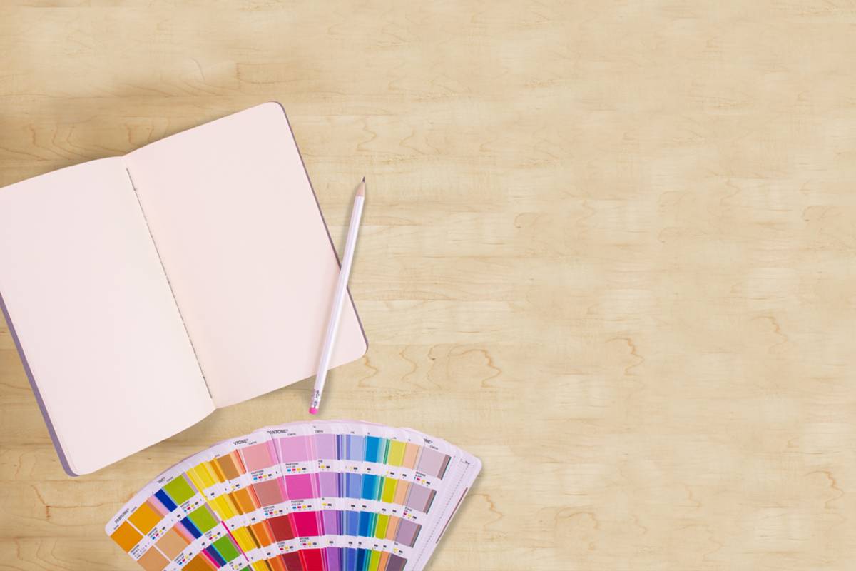
Each year companies such as Pantone and PPG Paints, announce a color of the year. As designers, it is essential to know what colors were picked and how they can impact brands.
Keep reading to find out:
- The 2019 colors of the year
- GRIT’s predictions for trending colors
- The meaning behind colors
2019 Colors of the Year
Each year, the color of the year that is selected has the potential to impact trends. The paint company PPG already announced their paint color for 2019 as Night Watch. According to PPG paint experts, this rich teal color, “allows homeowners to emulate the feeling of lush greenery and the healing power of nature in their spaces.”
Pantone, a company specializing in universal color descriptions for designers, announced Living Coral as their 2019 color of the year. According to Pantone experts, the color is “an animating and life-affirming coral hue with a golden undertone that energies and enlivens with a softer edge.”
GRIT’s Predictions for Trendy Colors
Although PPG and Pantone have their picks for the 2019 color of the year, the GRIT design team’s own predictions weren’t that far off! Here are GRIT’s predictions for what colors will be making an impact in 2019.
- Lissa Scott, COO of GRIT Marketing Group, predicts that Pantone 17-1564 (Fiesta) will be turning heads this year.”If you’re paying attention to Pantone’s 2019 New York Fashion Week color report, you see that bold, bright and lively is the trend. And, Pantone 1564 is a perfect shade of orange red. A color that evokes energy, passion and excitement,” says Lissa.
- Julie Lando-Cross, president of GRIT Marketing Group, anticipates seeing the popular use of bluish gray used more in design trends, but when it comes to fashion, she expects bolds to lead.“In the fashion industry, I see more of a return to a brighter color palette (still blue but bright blue as an example) and a balance of warmer earth tones,” Julie explains.
The Meaning Behind Colors
Understanding the color wheel and the meaning behind each color can have a major impact on a brand because it allows professionals the opportunity to pick a color that fits their industry and/or conveys something special about their brand.
According to Jen Review, each color has a unique meaning, which helps industries choose which colors are best to use in their branding efforts.
- Red is the color of fire, drama, love, heat, warmth, power, strength, excitement, passion, blood and lust. It has been shown to increase heart rate, breathing and to activate the pituitary gland. Therefore, it is best to use red in the food and restaurant industry.
- Orange is the color of energy, warmth, good cheer, excitement and good health. This color is best used in the home and healthcare industry because of its association with hope and cheer even in the worst of times.
- Yellow is a cheerful color that conveys excitement and happiness. It is the brightest color on the wheel, so it is often used in the construction industry as a safety precaution. Just like orange, it is also used best in the home and healthcare industry where optimism is needed.
- Blue is the color of tranquility, serenity and calmness. It implies loyalty, dependability and trust. This color is best used in the technology, healthcare and finance industries where honesty and trust are very important.
- Green represents the natural world, ecology and tranquility. It is the color of refreshment and fertility. It also has a financial association. Therefore, green is often used in the agricultural, gardening and recycling industries.
- Purple is the color of calmness, creativity, mystery, magic and meditation. It is also considered the color of royalty, nobility and luxury. Due to its association with luxury, purple is a color often used across many industries to make brands appear more deluxe.
- Pink is the color of femininity. Therefore, it is often used in the fashion, baking and wedding planning industries.
- Black is used to invoke the feeling of power, sophistication, mourning and formality. Black is also considered an elegant color. Black is used in many industries to make brands appear more sophisticated or formal than their competitors.
From logo development to website design, to product packaging to support materials, color is a critically important element in marketing because it communicates without the use of words. Color can be used to evoke an emotional connection between brands and potential customers, and it is often a component of a brand that is most remembered.
Interested in learning more about taking your design to the next level? Contact our team today.
For more tips on branding and marketing, check out GRIT’s other blogs here!