
INDUSTRY:
Non-Profit
SERVICES:
– Graphic Design
– Brand Strategy & Positioning
“GRIT did an excellent job listening to our nonprofit’s needs for redesigning our brochures, transforming them from standard materials into visually-appealing marketing tools. The team is always on time, responsive, and passionate about their work. We appreciate their creative approach in communicating our brand and message.”
Tim Steffen, MSEd
Director of Development & Communications
Compass Mark
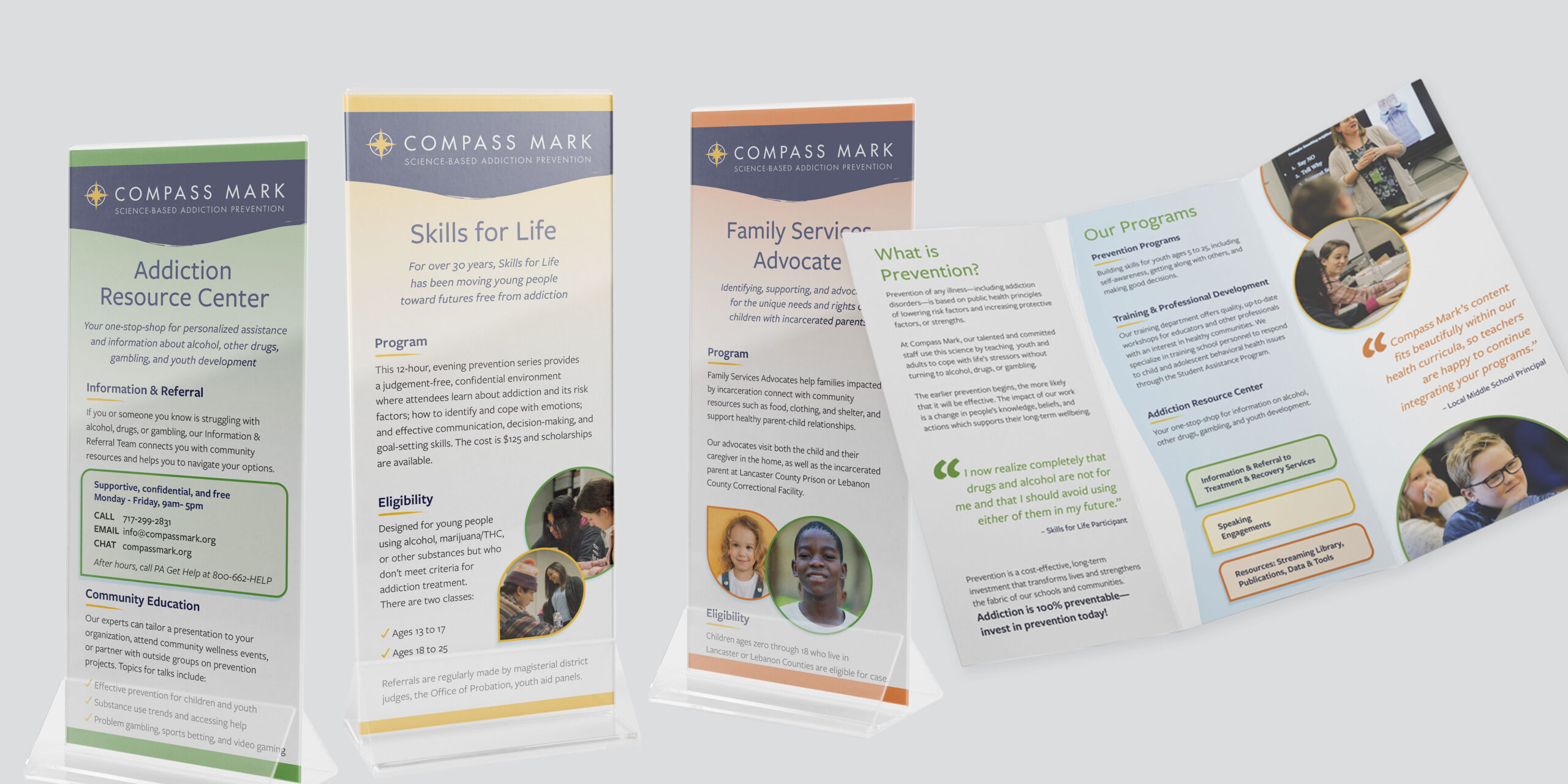
With a recently updated website in place, Compass Mark approached GRIT to carry the refreshed visual branding through several essential print materials. Chief among these was a trifold brochure that was a bit too copy-heavy and a series of rack cards that were not simple for staff to tell apart at a glance due to their uniformity. GRIT’s design team collaborated with Compass Mark leaders to reshape their written content and make each piece more visually impactful while keeping certain core elements—like their logo—in place.

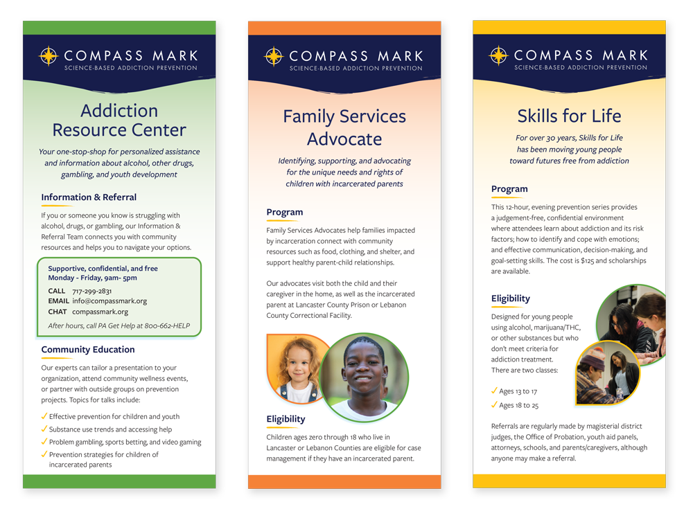
The brochure was redesigned with readability and accessibility in mind to incorporate the new accent color palette and call back to the website with similar layout and design cues. Photography was woven in to bring more life and connectivity, too. For the rack cards, GRIT’s designers introduced a color-coding scheme with Compass Mark’s accent palette to create first-look differentiation and make staff’s work easier when selecting individual pieces to share with clients.